Making a figure can take me hours, just to select nice colours.
So, I have my reservations about R, mostly because of habit. While there are libraries for using ggplot2 in python, I have actually tried working with my data directly in R. It is true that ggplot is good, I just need more practice. Since my supervisor even has his own R package that he will make work well with my pipeline output, I do need to know how to use it well!
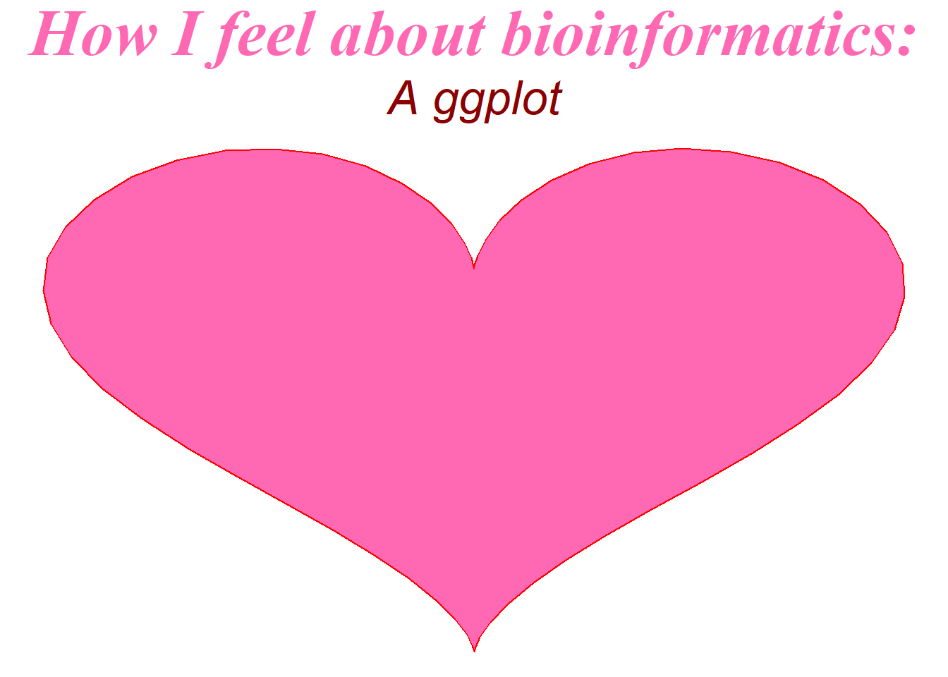
Code
library(ggplot2)dat<-data.frame(t=seq(0, 2*pi, by=0.1) ) xhrt <-function(t) 16*sin(t)^3 yhrt <-function(t) 13*cos(t)-5*cos(2*t)-2*cos(3*t)-cos(4*t) dat$y=yhrt(dat$t) dat$x=xhrt(dat$t)options(repr.plot.width =2, repr.plot.height =2)theme_set(theme_void())heart =ggplot(dat, aes(x=x, y=y)) +geom_polygon(colour="red",fill="hotpink") +labs(title ="How I feel about bioinformatics:", subtitle ="A ggplot") +theme(plot.title =element_text(family ="serif", size=35,color ="hotpink", face ="bold.italic", hjust =0.5),plot.subtitle =element_text(size =25, face ="italic",hjust =0.5, color ="darkred"))heart